Olark had not updated their Operator management interface since the launch of their application. As part of a job application design exercise, I redesigned the workflow and interface for adding “Operators” and chat groups to Olark.
The Exercise Prompt.
In the setup for the design exercise, Olark provided a short brief outlining goals, and set a 5 hour time limit on the exercise.
Put yourself in the shoes of an Account Admin who has just set up an account for a team of 10 chat operators. Your goal here is to invite those operators onto your account, and create three Groups to route different types of chats to.
Click around and familiarize yourself with the current methods for doing this, and then show us your recommendations to redesign those processes. The easier and more intuitive you can make it for a brand new Admin, the better. Please give us your thoughts in whatever form or medium you feel conveys them best.
A Missed Opportunity.
Olark’s pricing plans center around operators and groups, yet the interface did not have a consistent interface or educate customers on the impact that groups and operators could have on a support workload. I felt Olark missed an opportunity to sell to their customers.
I focused on an interface that educated a new customer on the impact Chat Groups and Operators could have on their support workload. I developed a workflow that grew with a customers understanding of the process, providing opportunity for advanced users to speed through the process.
I had asked Olark to provide more detail around their customers, trying to get a sense of the typical position within a company, team size, and computer familiarity.
With that information in mind, I started a detailed audit of their current interface, putting myself into the shoes of their customer. As part of my application, I called attention to the issues that I found.
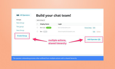
The Operator landing page did not describe the role an operator plays in an account, what Groups do, and felt confusing.
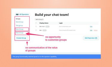
The group capability seemed bolted onto the process. Creating a group and adding operators to the group took place in two separate, non-standard screens.
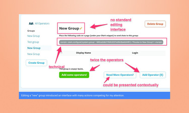
The group edit screen introduced an interface that customers had not seen before, that displayed competing customer actions.
While reviewing the Operator workflow, I came up with a series of web applications with similar components or features.
- Slack
- Hipchat
- Intercom
- Uservoice
- Helpscout
- Desk.com
- Customer.io
I tried to find in each of those applications a workflow matching the operator onboarding. Check out the research packet (PDF) I submitted as part of the design exercise .
Defining Project Goals.
In my process, I create goals to orient my design execution around. For the operator interface, I defined these goals:
- Emphasize the capabilities and impact of Operators and Groups.
- Streamline creation processes and editing interfaces. Creating and updating operators or groups should use the same interface.
- The interface should take advantage of existing tools to work smarter for the customer.
- Focus on the primary action for each screen.
Executing On A Plan.
I started designing the Operator landing page. This page provides a great opportunity to educate the customer on the capabilities and impact of Operators and Chat Groups.
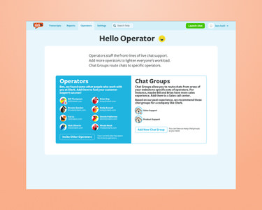
When I first started designing this screen, I thought I could call the group functionality Call Centers, but decided that it took the telephone metaphor too far.
I think all applications could use Clearbit’s API as part of their onboarding process. In Olark’s case, I’d use Clearbit’s API to find other people with the same @domain.com email address, and encourage a customer to add operators, while providing a fallback invite process.
In the current workflow, adding an operator or group took place in disconnected steps. I tried to allow customers to create groups and operators on the fly, but still put an emphasis on the primary action for the page.
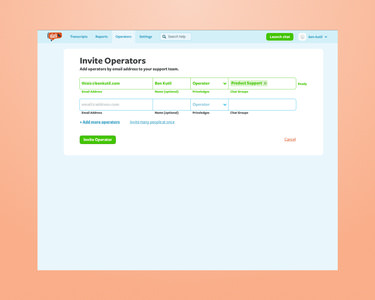
I felt Chat groups needed the most attention. Instead of creating an interface optimized for adding entries, I focused on an interface for making relationships. Groups represented relationships between Operators and sections of a website. That way, questions about athletic shoes would go to the right operator.
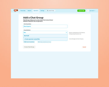
Create new members on the fly, and fill out their details after the group creation process.
I felt it important to remove the technical hurdles for adding a group. Administrators may not have access to the code base to paste code into. This became a barrier for setting up more groups.
I chose instead to give administrators the power to select specific pages or sets of pages for the group’s chat interface. I felt this allowed non-technical support leaders to use Olark’s group functionality without needing to involve a developer.
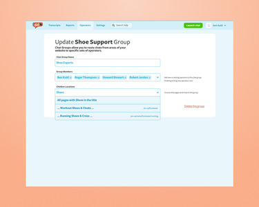
Instead of having to insert code, account admins can route chat messages into this group from sections or specific pages of a site.
Prototyping the Experience.
With the limited timeframe, I started with low-resolution wireframes for faster iteration. After sketching screens, I realized a high-fidelity prototype would help to communicate my ideas better, since I wouldn't have the chance to pitch or explain my work.
In Closing.
I believe constraints lead to better design. With the redesign of Olark’s Operator screens, a short, specific timeframe helped focus my efforts. Working with design components allowed me to construct a full userflow without much effort.
While I did not get the job, and feel conflicted about design exercises, I felt the work I created in a limited timeframe had merits, and I enjoyed pushing my design process.