Otis Rolley represented a new type politician for Baltimore, an official without political baggage. He saw the way design and digital strategy won the 2008 election, and wanted to make sure his campaign also utilized those tools effectively.
I used Otis’s city planner background and building blueprints as inspiration. Instead of a traditional blue, I used a purple tinge to tie into Baltimore’s love for their football team. Otis’s typeface was geometric, strong, and reads well at all scales.

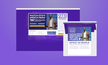
We used Otis’s presentation from TEDx Mid Atlantic as a way to introduce Otis and his policies.
I created the campaign’s primary website, issue specific landing pages, and donation emails. All elements shared between them a flexible design system, adapted to each specific use.

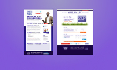
Initial mockups for the website and call to action page.
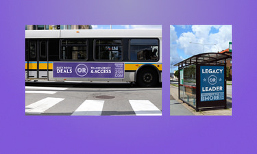
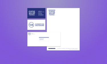
Throughout the campaign, I got to explore designing for new environments. I designed collateral, lawn signs, bus & shelter banners, and even building signage.


Otis’s well designed platform elevated his message above the competition.