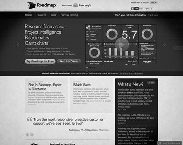
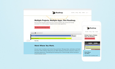
I worked with Roadmap to focus their website on customer impact, not a list of features. I took a complex and confusing site that lacked a direct call to action, and streamlined it into four concise pages.

The original website hid content within a carousel, which analytics showed people did not interact with.

After goal conversion tracking, I found that having one primary call to action led to the most conversions.
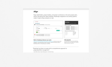
I organized the content of the landing page around four action words – Visualize, Align, Forecast, and Manage. I matched features and customer testimonials to those action words, providing a snappy introduction to Roadmap.

Action words helped organize the features I wanted to showcase.
Through a simple content strategy and direct implementation, I created a responsive marketing platform that boosted conversions and provided a solid foundation for a redesigned onboarding experience and application design.
Visit Roadmap