After a month of design sprints, I took apart a zombie “MVP” app, reorganizing and redesigning the application around two guiding principles.
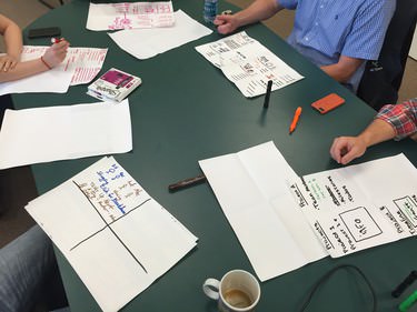
Each week I held brainstorming or sketching sessions during my product meeting.
A Brief Flashback.
I consulted with Roadmap off and on since 2010. As the application grew more and more complex, I knew it needed a comprehensive redesign of the application.
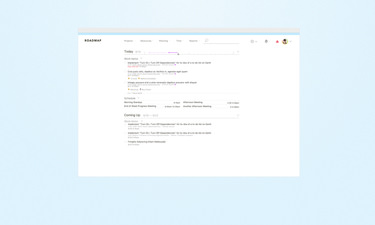
One exploration from 2010 for the redesign of Roadmap.
Roadmap, as a bootstrapped company, didn’t have the resources to take on a full redesign. They continued to add features to the original MVP, pushing it beyond a typical app lifecycle.
Over the years, this created inconsistencies that hindered the usability of the app. Combined with application instabilities, customers lost confidence that they could complete their tasks in Roadmap.
I came back to the project in 2015 to address this crisis.
Guiding Principles
Before the first design sprint, I put together “guiding principles” for the design and development of the application. These principles followed a positive over positive format, representing the attributes the application would put first. During the first meeting, we settled on two guiding principles for the application.
Clarity Over Convenience
The customer should understand the content, context, status and actions available to them.
Insight Over Analytics
A customer should understand the meaning and importance of the datapoints Roadmap provides to them.
I used these principles with the design team and in product meetings as a filter for our critiques.
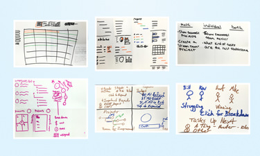
Sketches from a product meeting exploring the features of a Project page.
Mobile First MVP
I worked with design intern Jen Evans to generate visual directions for the application, focusing on the mobile experience first. I felt designing mobile first would help constrain the features and functionality we placed on the page.
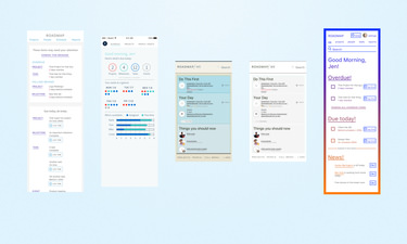
The smaller device format forced us to focus on the functionality that we included on screen.
Once we found a visual aesthetic we liked, Jen and I mocked-up user flows to test our design decisions.
Within the design, we made sure that our interface did not “hide” functionality, and limited the number of actions a customer would take on a particular page.
We applied our design system to Odometer, a stand alone time tracking tool for Roadmap. This gave us quick access to feedback to use in our design process.
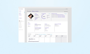
Each person has a detail page highlighting their utilization level, activity, schedule, and skills.
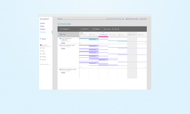
I put an emphasis on scheduling time separate from outlining and estimating a project. Those two tasks need different contexts and inputs, and would have cluttered the page together.
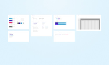
Jen took our initial designs and created a styleguide we could apply to all Roadmap properties.
Guiding principles made it easy to confirm feature and design decisions. Working in a mobile context first focused efforts on the most important features first.
See my work on Odometer, another project for Roadmap.